As we head into winter, we’ve finally taken a moment to take a step back and do that thing that most business owners probably don’t do enough of – review your own business.
We sat down a few weeks ago and put our consultancy hats on to analyse our business as a whole, looking at what we do, what our goals are and how we can serve our customers best.
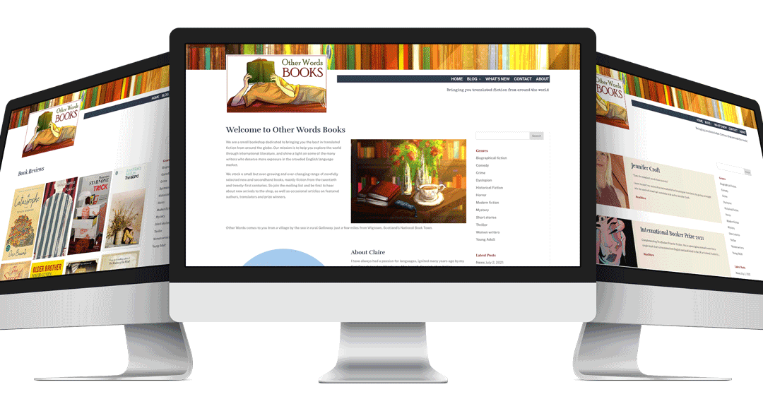
As we worked through the process, one thing was immediately clear, our website needed to get much better at telling people who we are and what services we offer. We were trying to appeal to everyone and as any half decent consultant will tell you, that’s a sure fire way to appeal to no one.
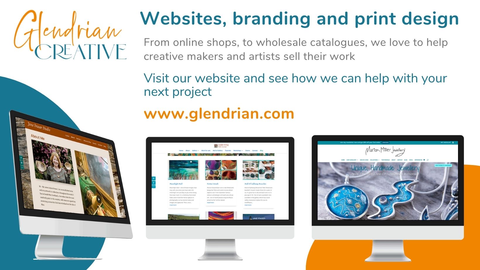
So now we are clear that we help small business owners and particularly those who have products they want to sell online.
That’s our background, we know the pain points, we understand the problems of growing (especially growing very quickly) and we have both the training and the first hand experience of how systems and technology can help businesses to be more efficient, so the business can focus on what it does best.
The language on our website was also a little bland so we addressed our ‘tone’ or ‘voice’ which we encourage all our clients to do. We tried to introduce a little personality and quirkiness, while still conveying all the important information we needed to get across.
We also spent a lot of time getting clear on what services we offer (and what we don’t) and working on our internal processes so things run smoothly behind the scenes.
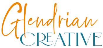
One of the last things to come out of the process was our branding and our logo. We knew that the two key things we wanted people to ‘get’ about our business were trust and friendliness.
Our old branding didn’t tell the right story. It was a mix of colours which actually were a legacy from a previous business and it was rather formal and stiff, not the right style for us at all. We’re all about jargon-free plain english, taking the fear out of the process and maybe the occasional bad pun along the way.
We tried out a few ideas and came up with a colour palette of blues, turqoise and orange.
Orange is a warm, dynamic colour that conveys feelings of warmth, friendliness and enthusiasm with a touch of playfulness – perfect.
Blue has many different hues, the darker blues conveying authority, credibility and trust, and the brighter turqoise plays off the orange and is associated with clarity and good communication.
Next we looked at our lettering and again, balanced our two keywords with a handwriting style script paired with an elegant, all caps font with a quirky edge. I love a good font pairing and I’m really happy with how these two work together.
The colours contrast very well as they are opposites on the colour wheel and that’s important for meeting accessibility requirements.
We are very happy with it, and think it achieves what we set out to do.
This is just one piece of a bigger picture and reminded us how important it is to step back from working ‘in’ your business and allow time to work ‘on’ your business.
When was the last time you took that step back and reviewed your business? Feel free to contact us if you think a fresh pair of eyes can help with that.
